
Vortex Logo Design
Category: Logo Design
Studio/Firm: Fluid
Clients: Vortex
Time: 2021
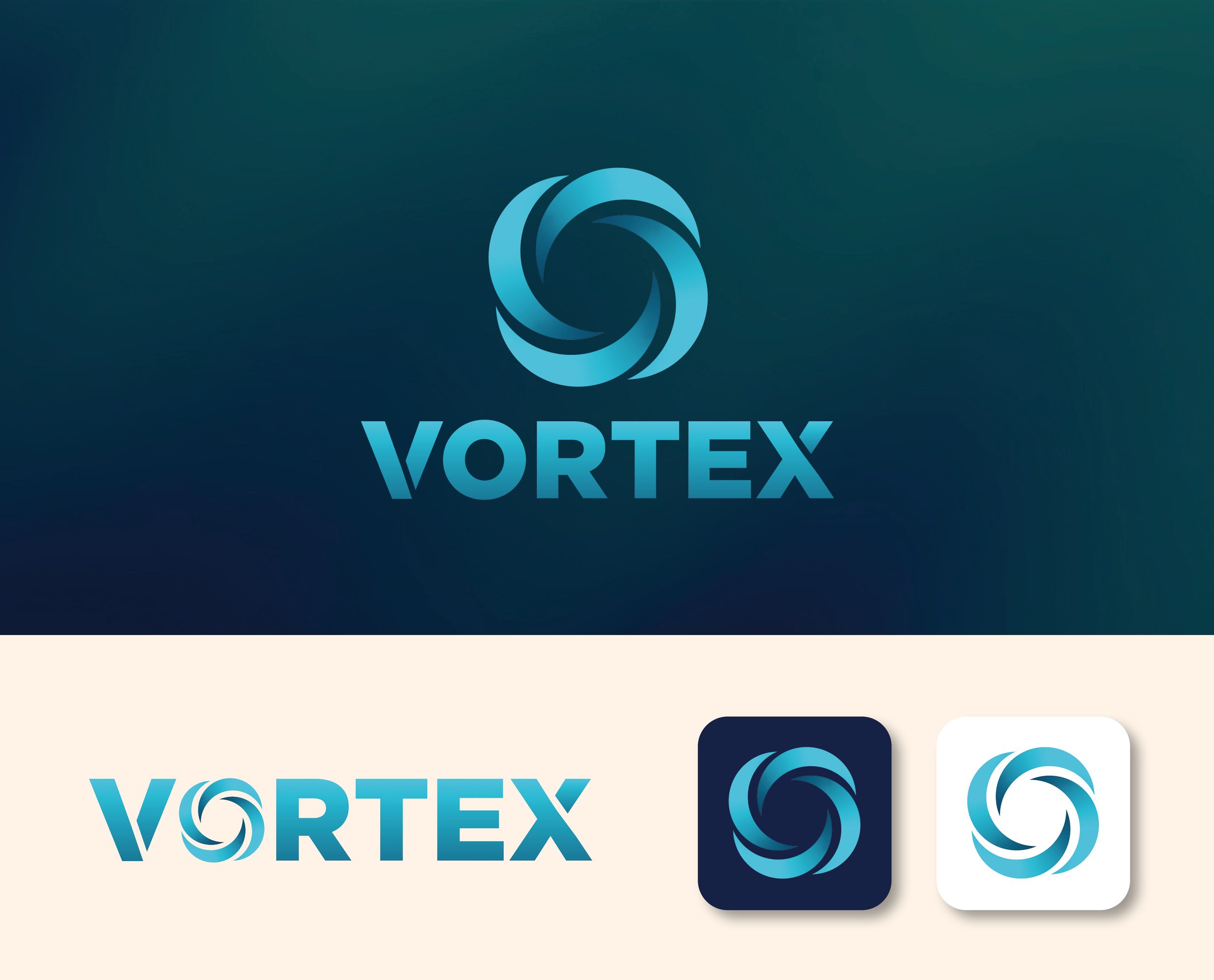
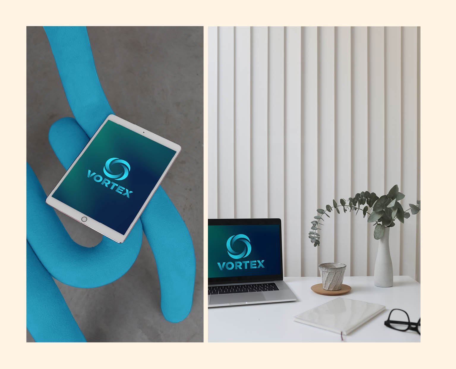
As a pro bono project, I had the opportunity to create a logo and its variants for Vortex, a software diagnostic company. Our goal was to convey the brand’s reliable and positive problem-solving characteristics through the logo design.
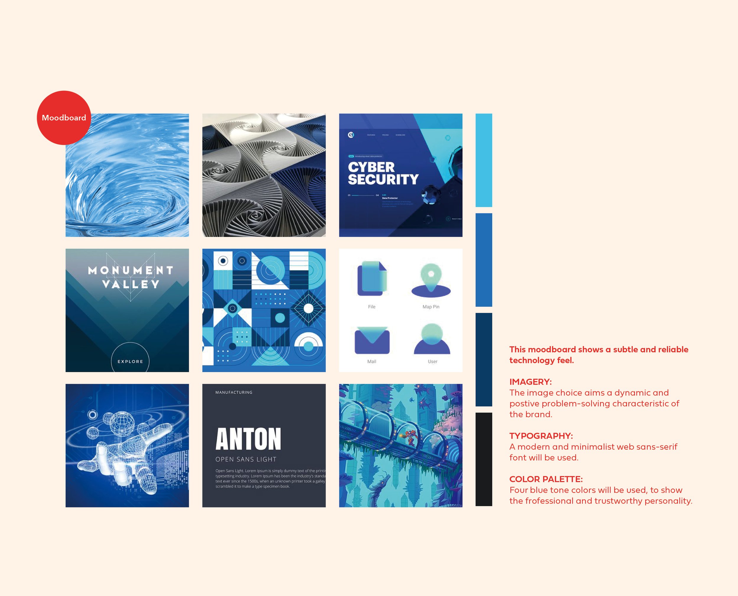
To achieve this, I opted for a modern and minimalist approach. I selected a web sans-serif font, known for its clean and sleek appearance, to convey a sense of professionalism. The font choice also aligned with the brand’s focus on software and technology.
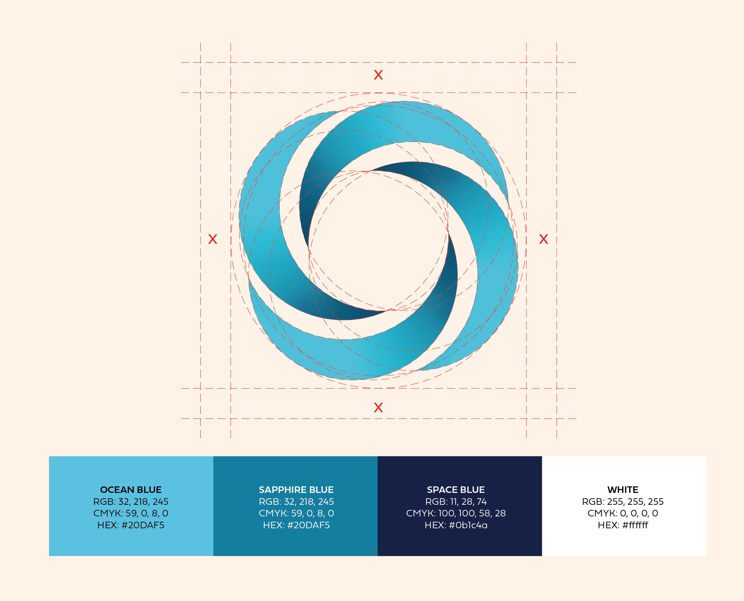
In terms of color palette, I utilized shades of blue. Blue is often associated with trust, reliability, and professionalism, making it a fitting choice to represent Vortex’s brand personality. The blue tones helped to instill a sense of confidence and establish the brand as a trustworthy and dependable solution provider.
The logo design itself was crafted to capture the essence of problem-solving. I utilized geometric shapes and lines to create a sense of movement and dynamism, symbolizing Vortex’s ability to navigate through complex software issues. The overall design exuded a sense of reliability, professionalism, and a positive approach to problem-solving.
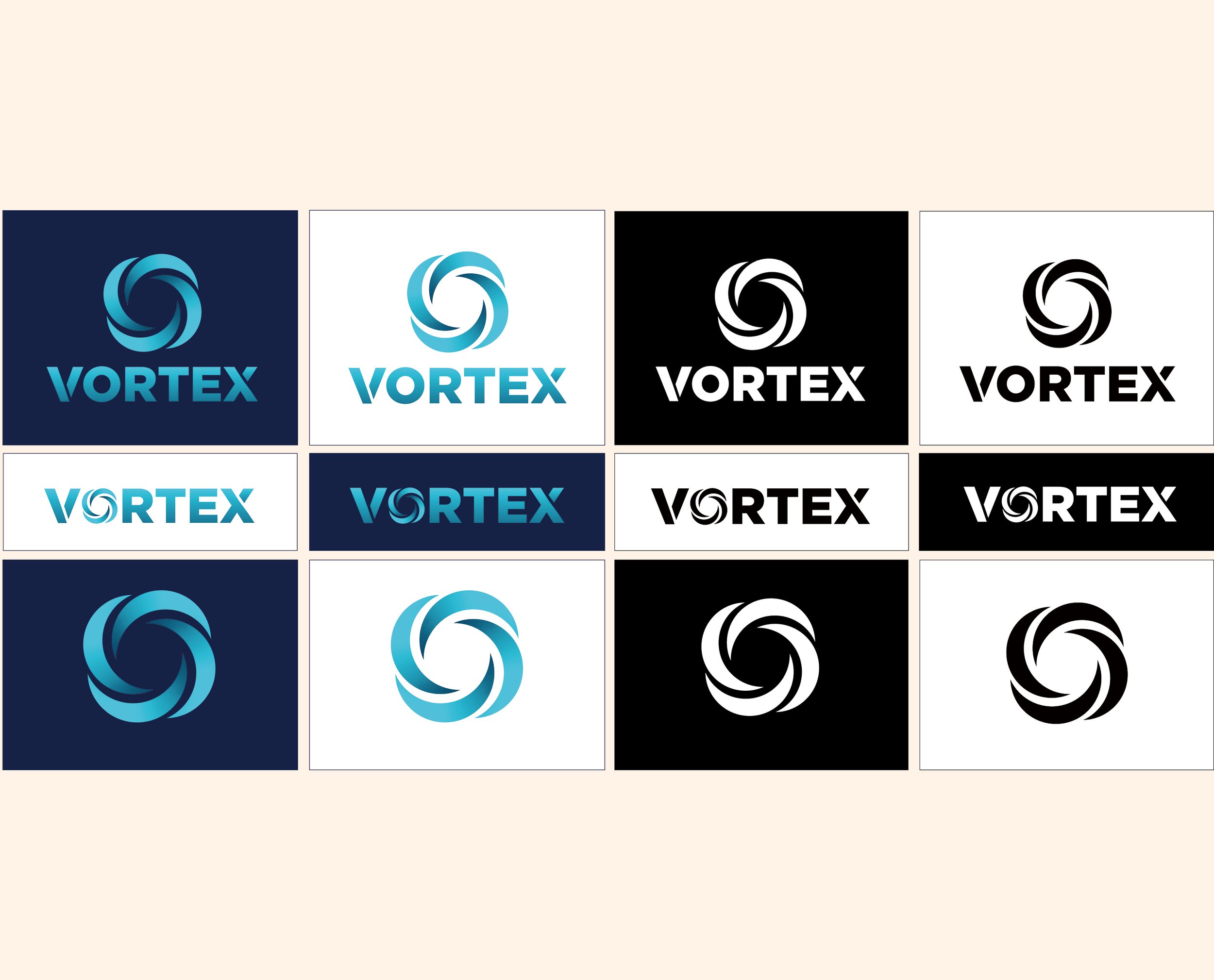
In addition to the primary logo, I also created various logo variants that can be used across different platforms and applications, ensuring brand consistency while accommodating different layouts and sizes.
By combining modern aesthetics, a minimalist design approach, and the appropriate use of colors, I successfully created a logo that effectively represents Vortex’s reliable and positive problem-solving nature.
Awards: dotCOMM Awards 2023, gold award winner.